![](https://cdn.myportfolio.com/79ecb97e-c5d1-4ad1-aaa4-03eb3a91d2de/664e1361-a4c3-4c43-a609-71f96d241bda_rw_600.jpg?h=16c886043a7111daba8bf6f7d17e5327)
![](https://cdn.myportfolio.com/79ecb97e-c5d1-4ad1-aaa4-03eb3a91d2de/cc71c9c6-3556-44b4-b680-54b38ec42440_rw_600.jpg?h=41350a6c5ec55983c77d98babfdca778)
![](https://cdn.myportfolio.com/79ecb97e-c5d1-4ad1-aaa4-03eb3a91d2de/f96f4934-d92a-4f06-b49d-4b002876994e_rw_600.jpg?h=df17c203c5c72034ade4aef06581a0b0)
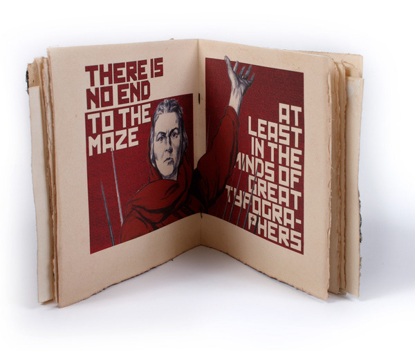
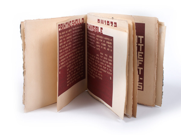
My responce to Betrice Wards written and spoken piece about typograpy should be invisable. My take on this piece this the designer should choose based on the project. I took a Russian Constructivist approach for the uplifting and empowering qualitys it has.